Egoist
A parfume brand for people who move with purpose
Branding
Concept
Egoist is a fictional premium perfume brand that focuses on self-confidence and presence. The idea started from a personal thought: I wear perfume to enjoy it myself. This became the heart of the brand — it’s about doing something good for yourself. You can’t please everyone, so why not make sure you please yourself? The name Egoist takes a word that often sounds negative and gives it a new meaning: it’s okay to put yourself first, to feel good, and to enjoy the moment.
Design Approach
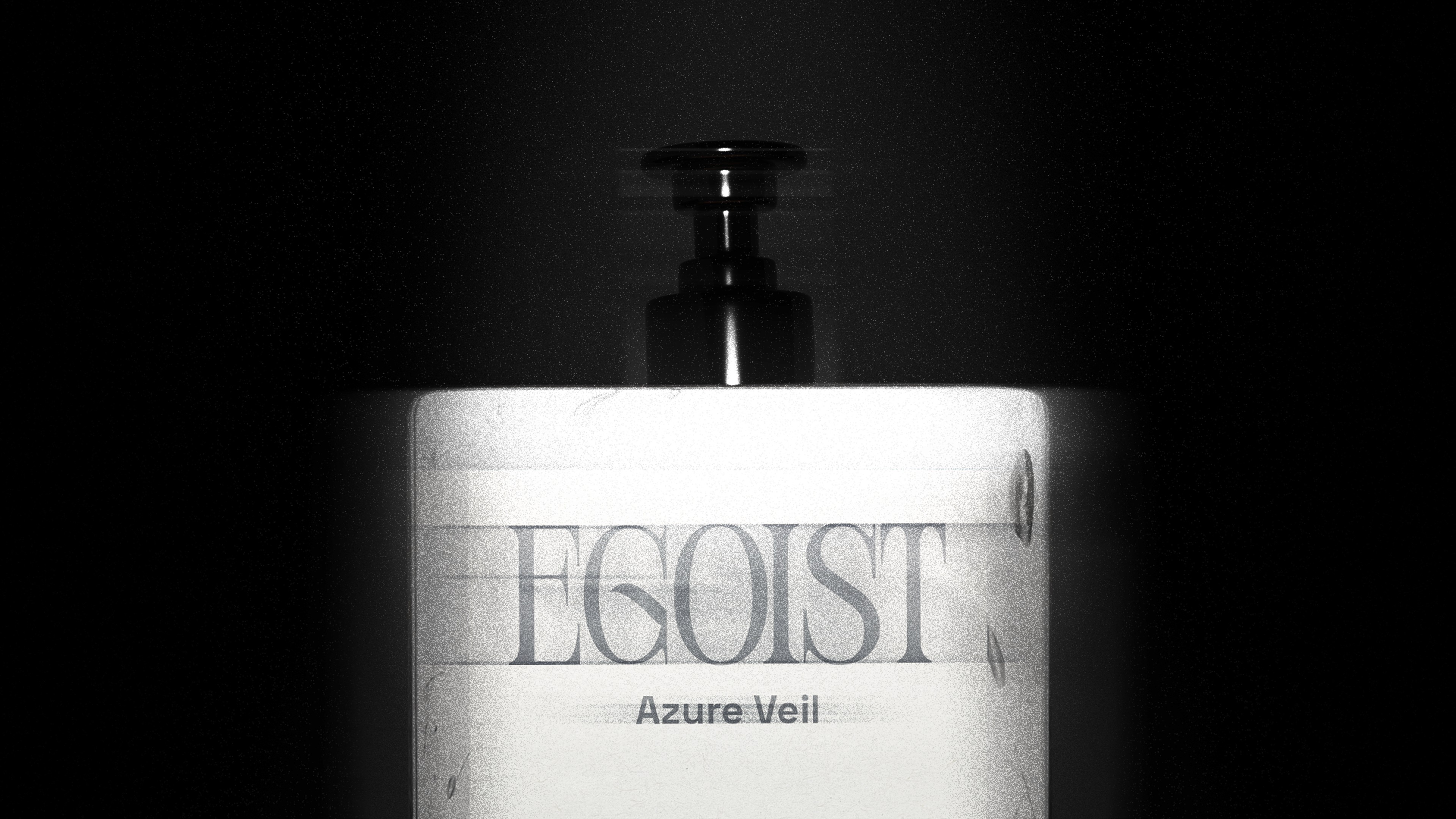
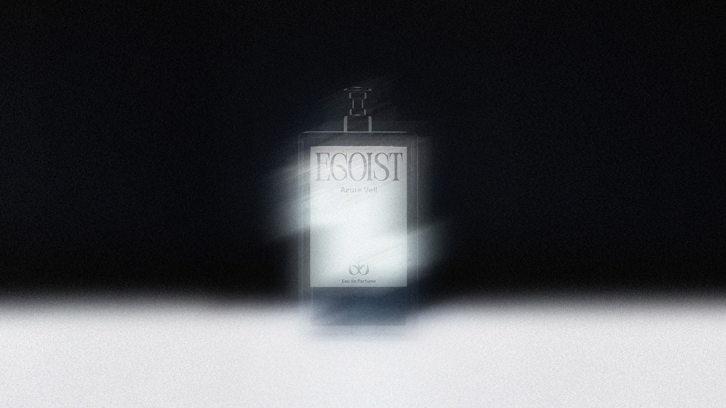
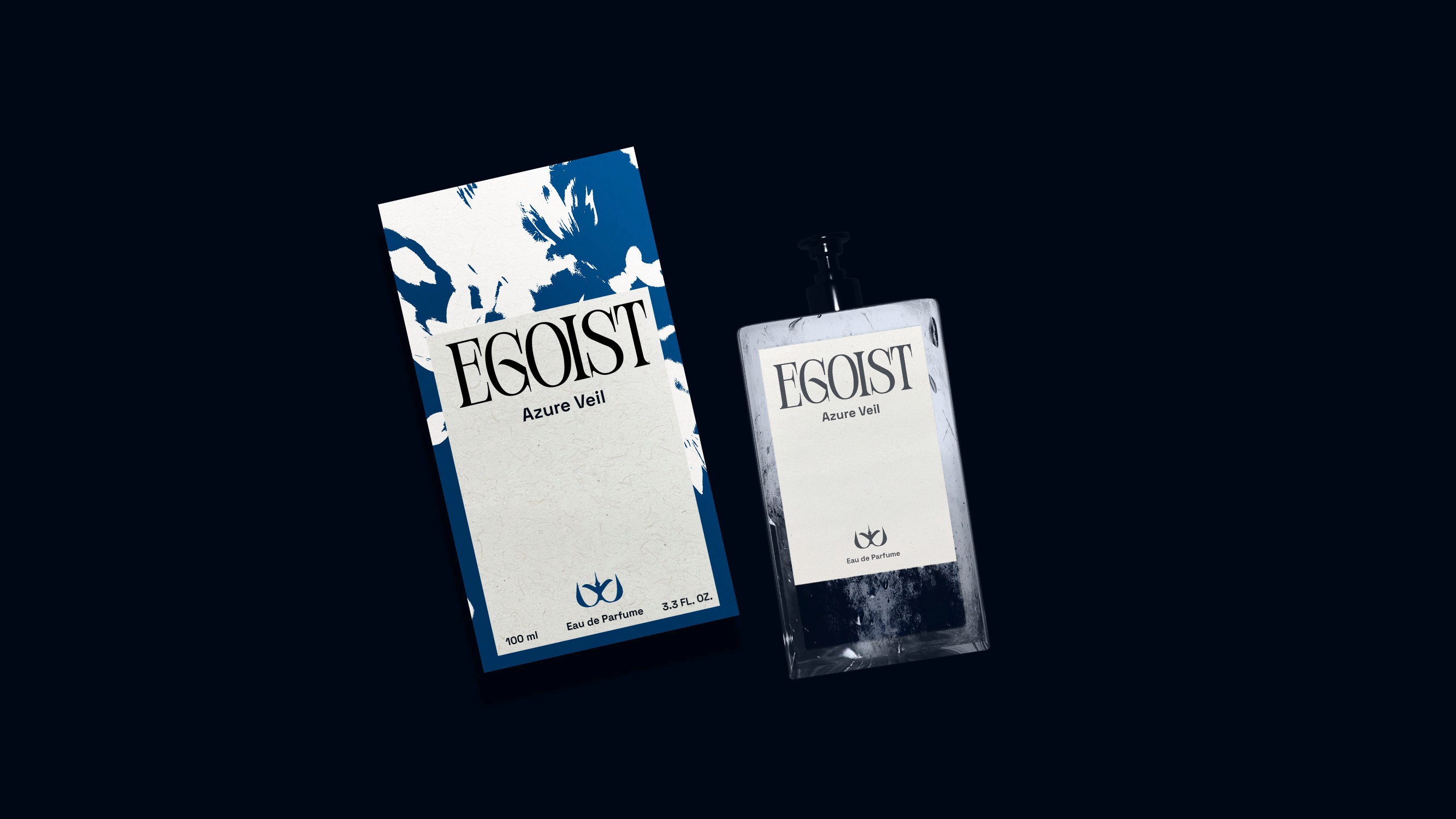
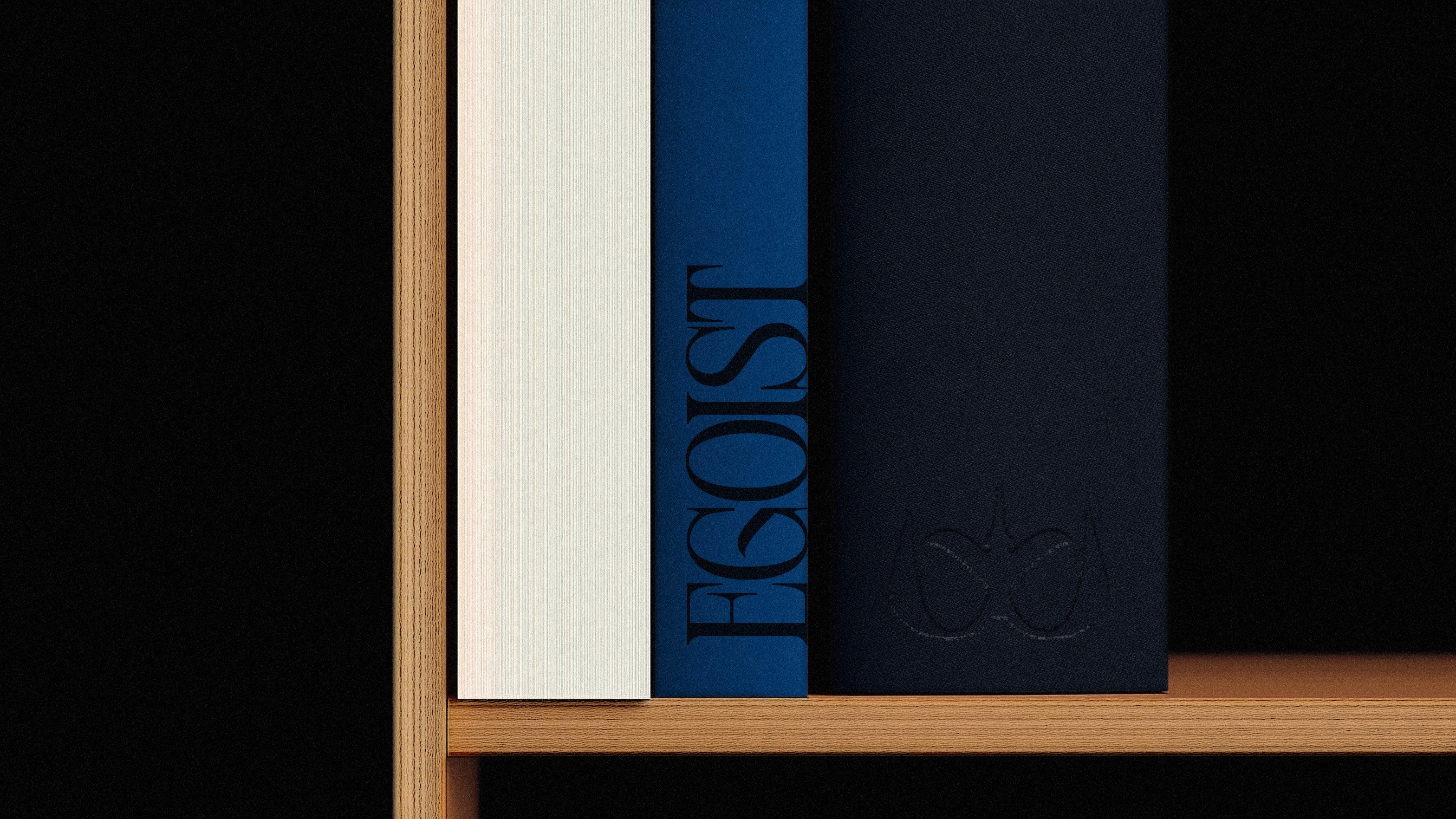
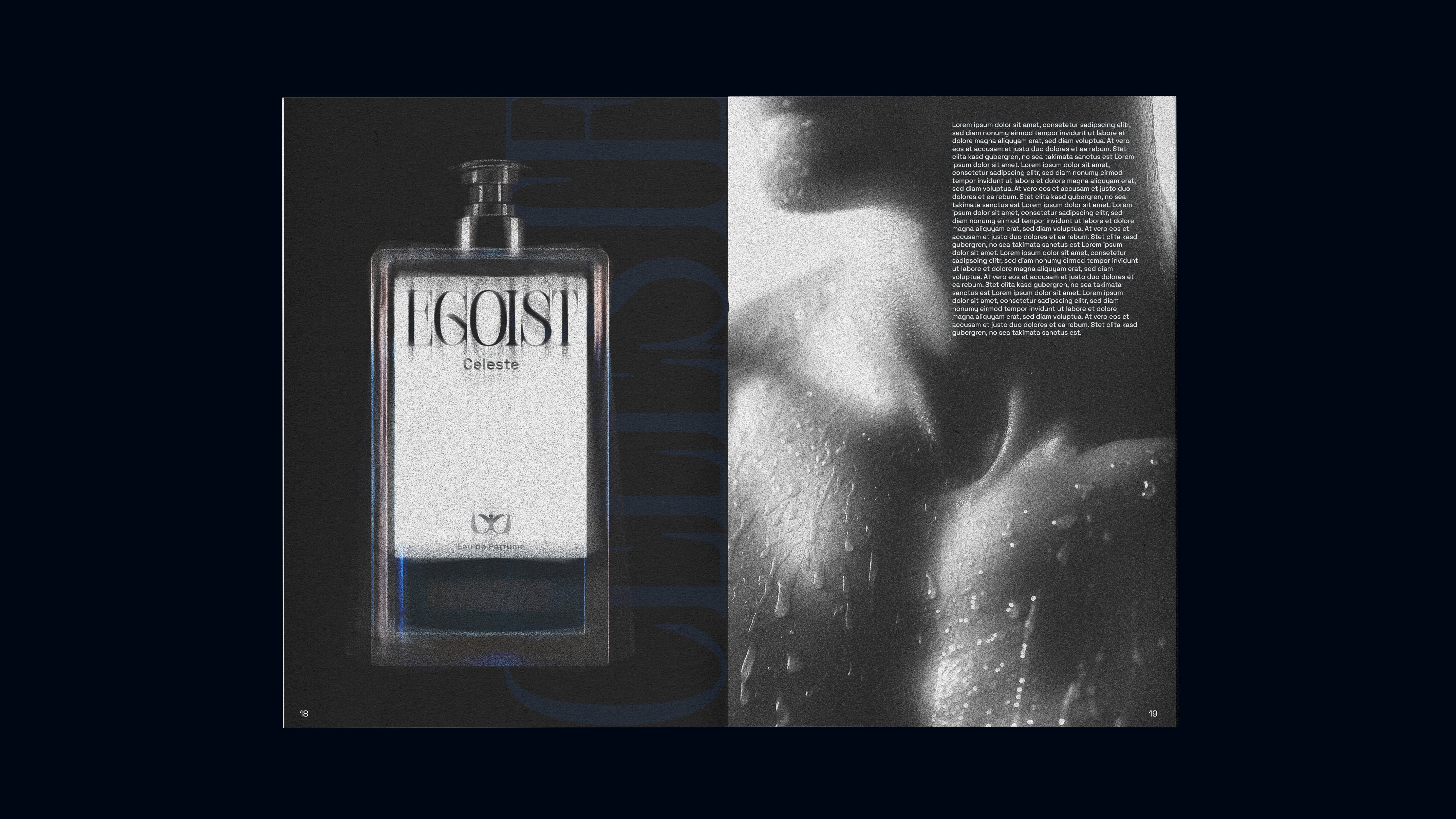
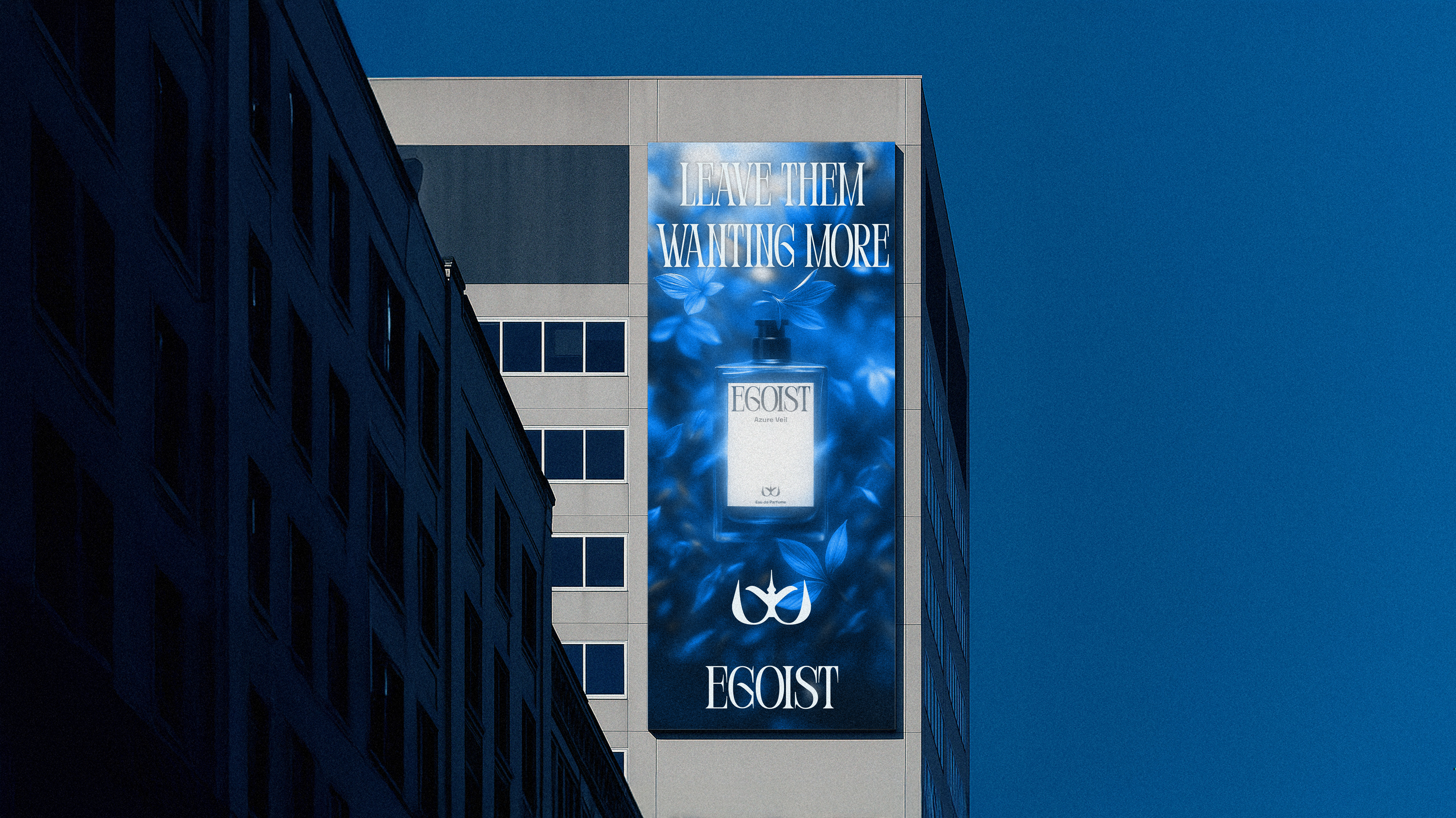
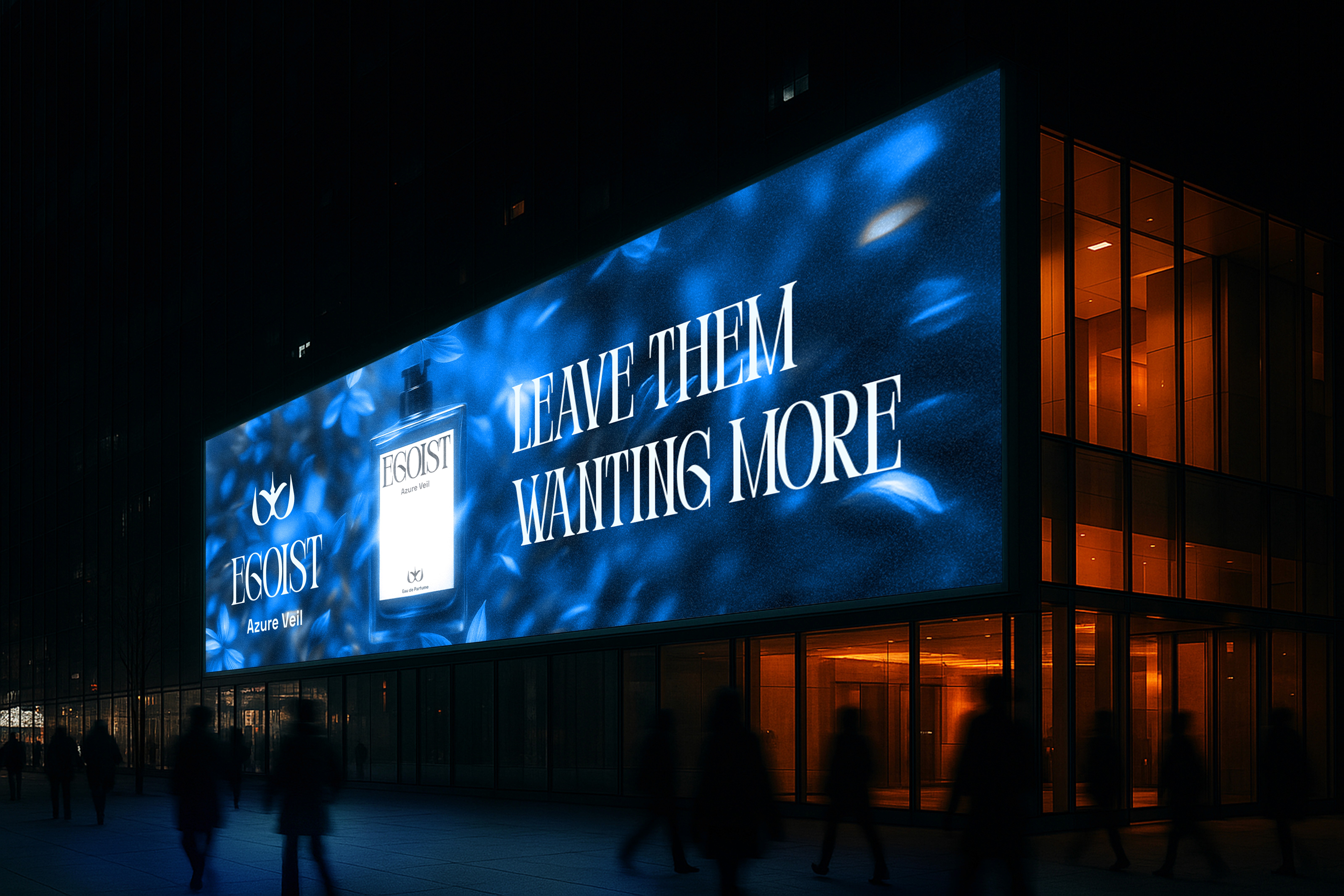
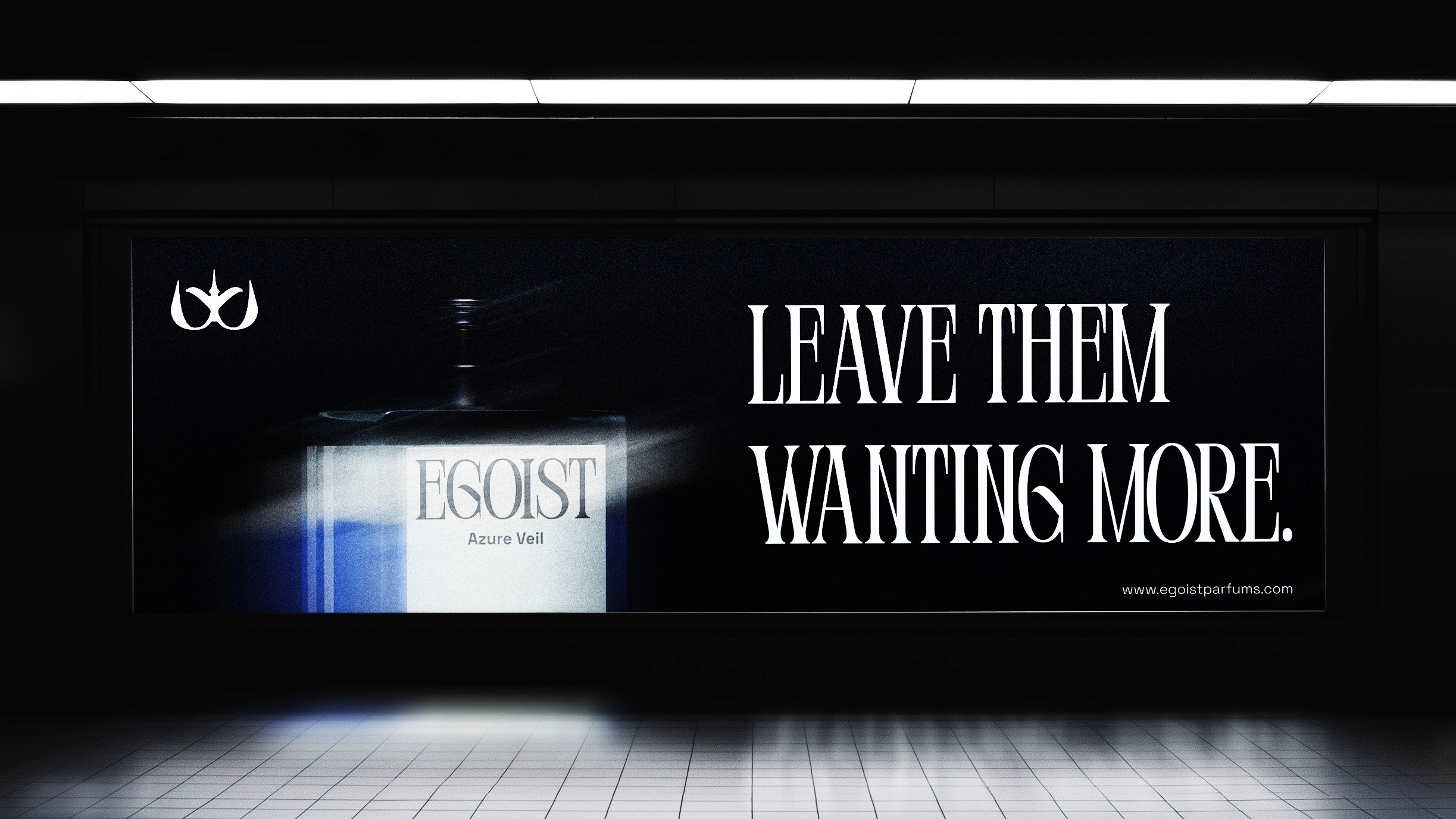
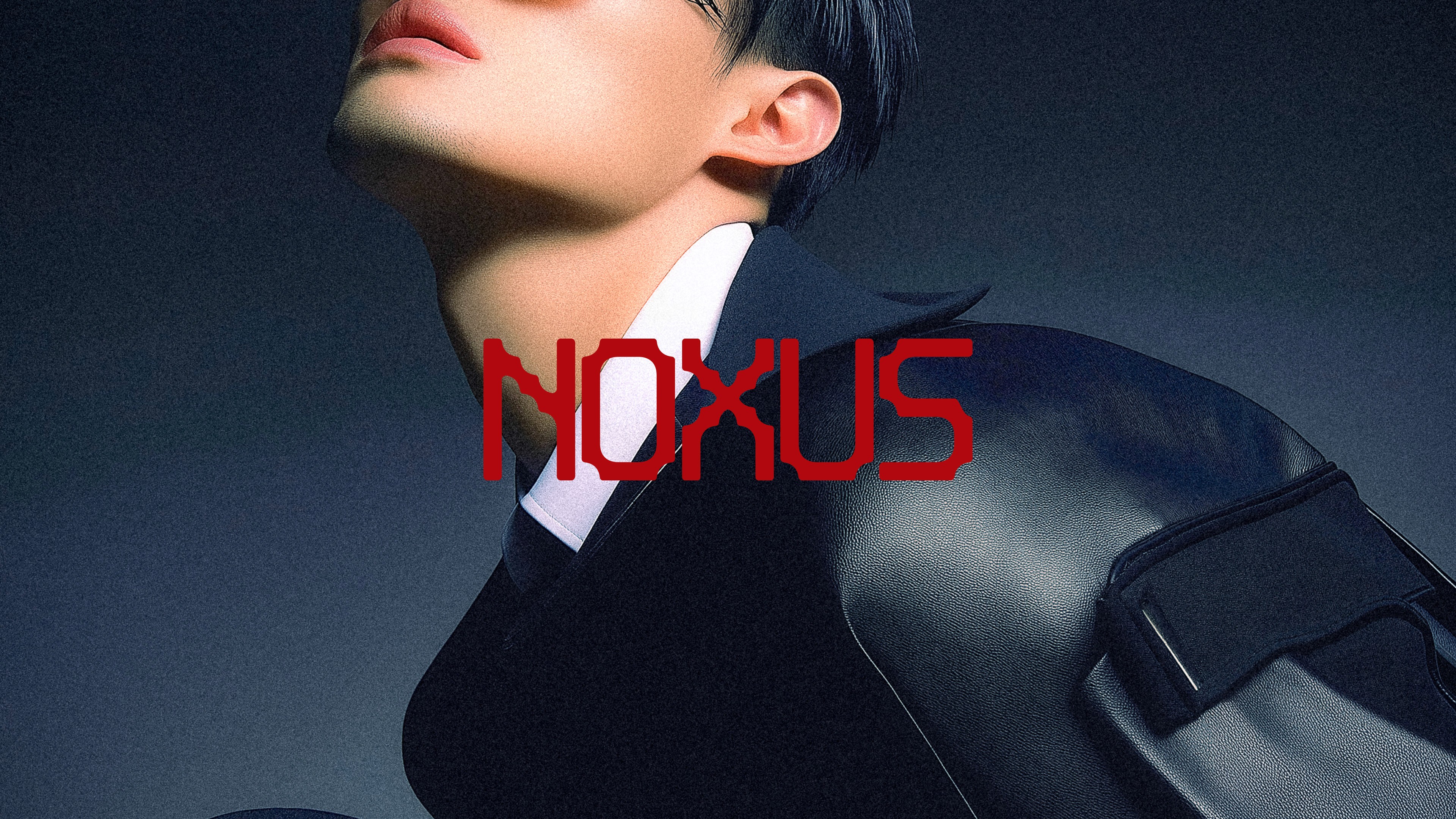
The brand is minimal but bold. The logo combines a crown and a flying bird — a symbol for being independent, feeling strong, and rising higher by caring for yourself. The wordmark uses a serif font to add a royal, luxurious feel. The color palette includes navy blue, royal blue, sky blue, along with black and white for strong contrast. These colors are loud, cool, and eye-catching. The images are rough and energetic: black and white mixed with bright colors, high contrast, motion blur, and texture. The brand voice is direct and a little provocative. A good example is the line: "Leave them wanting more." It fits the name Egoist perfectly — it’s about confidence and making a strong impression.
Process
I used Blender to create high-quality 3D product images. For artistic visuals — like flowers and human elements — I worked with AI tools such as Midjourney and ChatGPT. I finished and polished the images in Photoshop, adding details like texture, noise, and blur to match the brand’s fresh and powerful look.
Result & Impact
Egoist stands for premium, cool, and confident design. The brand look is meant to make people stop and take a closer look. If this perfume existed in real life, I would want people to feel drawn to it, to want to try it, and to wear it as a way to show self-respect and leave a strong, lasting impression — even after they’ve gone.


More Works
©2024
Egoist
A parfume brand for people who move with purpose
Branding
Concept
Egoist is a fictional premium perfume brand that focuses on self-confidence and presence. The idea started from a personal thought: I wear perfume to enjoy it myself. This became the heart of the brand — it’s about doing something good for yourself. You can’t please everyone, so why not make sure you please yourself? The name Egoist takes a word that often sounds negative and gives it a new meaning: it’s okay to put yourself first, to feel good, and to enjoy the moment.
Design Approach
The brand is minimal but bold. The logo combines a crown and a flying bird — a symbol for being independent, feeling strong, and rising higher by caring for yourself. The wordmark uses a serif font to add a royal, luxurious feel. The color palette includes navy blue, royal blue, sky blue, along with black and white for strong contrast. These colors are loud, cool, and eye-catching. The images are rough and energetic: black and white mixed with bright colors, high contrast, motion blur, and texture. The brand voice is direct and a little provocative. A good example is the line: "Leave them wanting more." It fits the name Egoist perfectly — it’s about confidence and making a strong impression.
Process
I used Blender to create high-quality 3D product images. For artistic visuals — like flowers and human elements — I worked with AI tools such as Midjourney and ChatGPT. I finished and polished the images in Photoshop, adding details like texture, noise, and blur to match the brand’s fresh and powerful look.
Result & Impact
Egoist stands for premium, cool, and confident design. The brand look is meant to make people stop and take a closer look. If this perfume existed in real life, I would want people to feel drawn to it, to want to try it, and to wear it as a way to show self-respect and leave a strong, lasting impression — even after they’ve gone.
More Works
©2024